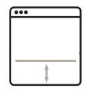
Just an hour ago I had a client email me to let me know that they couldn’t see the text at the bottom of a quick report I created for them.
Reason: The task bar at the bottom of Windows 8 was overlapping the browser window.
In my head, I started thinking “okay, why not just reduce the size of the browser”. But, then I considered the annoyance of having to resize the browser just to see the text at the bottom of a page, then maximizing the browser window again afterwards.
The simple solution: Add some padding at the bottom of the document.
This tiny little issue alone has made me kind of re-think the whole concept of sticky footers. I use them quite often as a design consideration, but now I’m considering that they might be a usability-concern in some cases.
If you have a “Contact Us” link at the bottom of your sticky footer, it might interest you to find out that a small percentage of users might have some difficulty seeing it, depending on their browsing environment and OS.
Just another totally random thing that none of us wish we had to think about!
